Monday, November 9, 2009

Moooooooom!!

Totally non-design related.

It's traumatic enough for a child to lose his mom, let alone a goat.


Brought to you by the Wonderful Winchester Brothers:


Tuesday, November 3, 2009

JimCarrey.com


JimCarrey.com


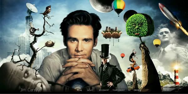
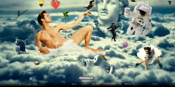
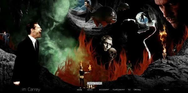
Welcome to the mind of Jim Carrey. It's awfully rare to see a major Hollywood actor having their own official website to begin with, or even simply have it contain more than just their filming credits. JimCarrey.com was carefully built to reflect the actor's identity and experience (based on most character he's played for many years), thus end up creating a very bizarre personal branding... and also a glimpse into the mind of his.


Are you scared yet?


It's very Monty Python-like, but then again, exploring 'his mind' gave me slight nausea and confusion just by sticking around for a minute. Technically, the traveling motion that works as a transition from one section of the page to another was carefully animated to give a sense of 'dwelving' into one's mind.


I want to smoke whatever Jim's smoking.


Since he is already a well-established actor via comedy films then watching him take more serious roles to some twisted villainy types, most of us (fans or not) are already prepared by the personalities Jim Carrey has embodied. Sure, this website might seem a little scary, strange and eccentric but it actually made me feel a little step closer to the actor. I am very, very sure he plays a role into building/designing this website, which made it seem like he took the time to dedicate his personal side for us commoners.


Very up close and personal indeed


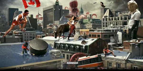
I absolutely love the interactive parts of this domain, and the levels of layer some of us can explore (you just need to click around a lot) which acts like Easter eggs. I am still amazed that as I'm going deeper and deeper into this website, I am often reminded that this isn't just a page of some design company, or even a site to promote a film... but actually from a very well-known Hollywood actor and comedian.


Wait, he's Canuck????


Whatever, I still love you Jim Carrey.
JimCarrey.com


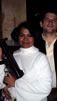
This post was brought to you by Princess Leia.


Wednesday, October 28, 2009

SURFACE : A film from underneath from TU+ on Vimeo.


Surface by Varathit Uthaisri


This piece is breathtaking. An experimental short film (for a thesis project) done by (Communication) Design and Technology grad students from Parsons School of Design (yay my ex-school!), explores the point of view from underneath the urban space we took for granted, every day. It's purely fascinating, as this short film brings a fresh point of view (pun intended?) to our daily lives in the city.

I know this is a mix of footage and animation, but I cannot help but wonder the props they used to demonstrate all the human actions happening above it. It's brilliant!


Wednesday, October 21, 2009

Okay, I love Justice. And this is another music related post. I'm sure we're already familiar with their DVNO videoclip, which consisted of every possible title card from 70s to the 80s on television! It's insane! The transitions are perfect from one identity to another, made to reflect the lyrics of the song. I wonder why most title card/logos back then were made on a darker background? Or am I missing something?


Justice - DVNO from Freedom Record on Vimeo.


Thursday, October 1, 2009

Tee hee. I know this animation is old, (heck, all of my motion features here are a bit dated anyway, but still interesting), but it's one of my favourite stop motion pieces. Western Spaghetti, made from your everyday objects. Very well put together and thought! I especially love the shrinking dice!!!!

But to chop off your dollar bill and throw it into the pan? Honey, that's how I roll. Except that the Washingtons belong in the toilet, and Lincolns in the kitchen. I'm a little high class that way.


In this economy crisis, I think we all should save money and begin cooking our own furniture.

Wednesday, September 30, 2009

hahahaha. I cannot stop doing this. I don't, I don't. And all of these are examples we students, with no sleep, no social life and food, can achieve within a week. Okay, at least by the end of semester. It's possible. I think.


MK12 // Funkstorung: Sleeping Beauty from MK12 on Vimeo.

Nando Costa, I love you, you're one of the earliest modern father of motion graphics (p.o.v), and you started with slicing layers and animating piece by piece in Flash:

"My Red Hot Car" for Squarepusher from Nando Costa on Vimeo.


and now?

you just killed me with this.


"Attract" for Zune from Nando Costa on Vimeo.


WHAT THE HELL. I LOVE THE LIQUID FLOW OF EACH TYPE TRANSITION!!
EVERYTHING IS WAY TOO SMOOTH! HOW CAN I TOP YOU LIKE THIS??!?

....So I once knew a teacher who knows Costa. Apparently Costa is already married, so... it looks like I've to go back to the drawing board. You know, actually working hard.
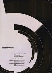
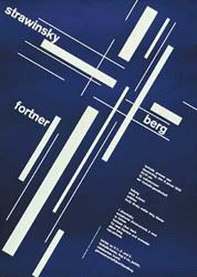
The Brockmann Remix.

Okay, final post for this week. Then I'll stop.

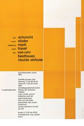
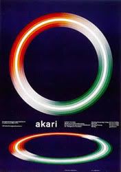
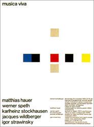
God I hope all of you know who Josef Müller-Brockmann is. He was a Swiss graphic designer, famous for his grid-like, clean and very simplistic work for concert posters in the 50's. And he used my favourite typeface too! Akzidenz-Grotesk! Mother of Helvetica! His sense of style was very, well... Swiss-like. Everything is in order and within the ruler, or the grid. Even when it was tilted diagonally. He also used solid colours and basic shapes to emphasize on the meaning or information of his visuals. While my style is usually more messy, inorganized and way too... "experimental", I will always appreciate something which I find difficult to achieve. The Brockmann style.

Some of his works (to refresh your tired memory):


Remember now? No? I know, my history book is hidden somewhere in the closet too. That's why I can't really provide more information on these posters hahahahaha- ahem.


Gary Butcher, an animator from the UK took it a step further. He took Brockmann's posters apart, piece by piece, converted them into individual layers, and then animated them as smoothly as possible. The transitions from one poster to another were flawless. I absolutely enjoyed how he manage to balance the footage with type on it (very Tibor Kalman, very 90's) according to the music. So if you are thirsting for motion graphics typography for the past 4 weeks, here's something for you to drink on:


follow original link here (.mov file): http://dvblog.org/movies/04_2006/josefmullerbrockmann.mov


You KNOW san serifs will never do wrong. Song is 'Soulhack' by Forss *downloads it*


Enjoy watching it and selamat malam (good night)!

Tuesday, September 29, 2009

Particle-ly

I feel like on a url!spam here. Suddenly there is a surge of sweet, motion memories returning to the small shell which I call head and I had to put everything down here before... before... before I get lazy to blog again hahaahhah

M83 - We Own the Sky from David Altobelli on Vimeo.


I LOVE the band M83, which proves the pinnacle of my closet hipsterhood, but their videos are always, always, always about angsty teenagers in 80's get up. This take on the video (I think m83 had a video competition for this song) was more abstract, modern and has more techno feel to it. I am stunned by the beauty (artistically and technically) of the blanket of light moving gracefully like water, but I am still trying to figure out what the hell are the swinging bulbs and the dude in black about.

Wait for the climax of this song. It was composed so beautifully, like a burst of emotions coming from a person. The visuals even nailed it!

Not much info on David Altobelli (director), or Dan Norton(animator). Altobelli's website explained little of him, perhaps he would prefer his portfolio to reflect him more than explosive Flash or crazy graphics we tend to see on designers' website (cough mine cough). I don't know how hard is to google Dan Norton without getting Ed surface from the results (you irresistable sexy beast Ed Norton you!)-

Okay, I lied. Here's Dan's website. I just needed an excuse to mention Ed anddddd Fight Club after that.

I understood the particles were generated by a plug-in (I lost count from the video) in After Effects, but it looked like there was massive rendering to do! My laptop would have melted on the 'render' button alone!!!


Listen, I've gone through particles before. I had only 3 motion graphics classes during undergrad, and wham! I had this 'brilliant' confidence to resort to that medium for my Senior Thesis. But that was 2 years ago. See my work for proof of Ummi's particle experience:


Yea, um. I hope the video shows up. Don't laugh. I've tried my hand on this, okay?


Sansula

I love electronic music of all levels, especially drum and bass (makes my ears pop in a good way), and you have to thank the Europeans for that. For Dominik Eulberg's video, Sansula, directed by Dirk Rauscher of Bruno Tait (VJ Team). A sansula is a type of instrument from kalimba made from flattened metal on wooden box. Eulberg must have used the instrument as the main composition of his song, which evokes a xylophone-y, ethereal like sound. I call it 'ethereal' because it feels... pure? You can ignore me now.

Before we begin, this is a kalimba:


And this is a sansula:


Kinda looks like en eggslice, of which I used to play as a harp. After enjoying the salad.


Dominik Eulberg's Sansula

SANSULA Dominik Eulberg musicvideo from dirk rauscher on Vimeo.
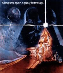


I absolutely love the simplicity of this video. It was simply a projection on to the trees, combining nature and technology together. Obviously Rauscher prepared the colourful animation beforehand, but it wasn't the technical or visual detail from it that was mesmerizing, but how light fell on to each leaves, stem, branches and flowers. GORGEOUS.


I believe I've just got a great idea for an outdoor party.


Sunday, September 27, 2009


HAPPY BIRTHDAY TO ME!

I am 25 now.

1984 was the birth of Transformers, Teenage Mutant Ninja Turtles and The Ghostbusters. SO WE OWN YOU. IMAGINE LIFE BEFORE 1984. HOW WAS IT? BORING, RIGHT? Michael Bay wouldn't be rich if it weren't for 1984, people would still ignore turtles and as for ghosts? They... would still be as scary.

As a gift for myself, I'd like to ask you. What do you get, when you take...


with

?


You get this:


This intense marriage between two- wait, THREE of my favourite things (saul bass, star wars and swing music) were done so tastefully that I simply cannot deny its existence. I LOVE IT. I wish I knew more details of this animator (his youtube account doesn't say much), but obviously he used Bass' papercut animation style to portray the opening titles, according to the tempo. Not that I said style not technical style. This is definitely achievable in flash or after effects. I can see the inspiration coming especially from The Man with The Golden Gun:


This style has inspired many, especially opening/ending titles for recent films like 'Catch Me If You Can" (we all know how it looks like so I don't have to show it to you guys okaaayyyy) and The Incredibles. It appears at every trumpet blare with great timing, and followed so closely to the stamp on titles of the 60's era. Can you imagine how it was back then, to animate opening titles frame by frame? After Effects has spoiled us all, and yet we are pushing ourselves further with the technology we have!!!!

Since it's raining like crazy here on Sunday, I am just going to shove the cheesecake into my mouth and cry myself to sleep...

Wednesday, September 23, 2009

EVERYBODEHHH

CAN I STEAL THIS FOR MY MOTION GRAPHICS BUSHWICK PROJECT PLEASE, CHRISTIE?

street tests from Najork on Vimeo.


I promise I will bathe it and feed it and love it and....


Okay, there is no way I can achieve this technically, with my SUPERB A.E skills /sarcasm, but motion tracking is something difficult to control. Obviously Najork used a single program (or plugin?) to master these effects, but he/she (ze?) managed to throw in an internet meme* at the end!

The footage of this video and 3D artwork combined strongly what Bushwick is about. Even though I DON'T think it's Bushwick at all...


I am horribly inspired! Horrible because I can get a little too ambitious.


*The term Internet meme (pronounced /ˈmiːm/, meem, rhyming with "cream"[1]) is a phrase used to describe a catchphrase or concept that spreads quickly from person to person via the Internet, much like an esoteric inside joke.[2] The term is a reference to the concept of memes, although this concept refers to a much broader category of cultural information.


via Wikipedia.


p/s: if you don't know what a meme is, give the internets to someone else who might appreciate it.


pp/s: I know. WIKIPEDIA IS ZOMG RELIABLE SOURCE! /sarcasm


Bloody Type

Symphony in Red by Sehsucht from inii kim on Vimeo.


I know designers usually notice details visually on print, film, or whatever and get a little critical on the colour balance, typography or even the layout. It is definitely obvious if the aesthetics of a poster or film titles are successful, but what captures my attention more is the sound or music that goes with it.

That's why I end up watching Star Trek three times already! Okay, Spock's got to do with it, but...


I love doing motion graphics, and from my experience (both professional and educational) it is always easier to animate something based on a ready-tempo. Oh to animate to your favourite song is always an emotional journey! Then again I am a little too emo these days ahahahah

This is one of my favourite motion/animated pieces, and it's by German post-production company Sehsucht GmbH* and music composed by the genius Turkish pianist, Fazil Say. I could say it was a perfect marriage solely between footage and after effects, but to achieve a more specific (floral) shapes of the blood drops definitely requires a 3D program or two!


Enjoy Symphony in Red for Konzerthaus Dortmund!

GmbH is Gesellschaft mit beschränkter Haftung, a legal entity similar to LLC, Private Limited or &co.


Thursday, September 3, 2009

Motion Mojo

My first design blog. Actually, it's for class. It's a good outlet from my spamming design links on facebook, and not cramming my bookmarks too much!

I don't know what got into me when I decided to jump into the motion/broadcast industry after graduation, with weak knowledge of animation but enough for print, but I absolutely love it! While working/freelancing/interning from one place to another (I did two places actually, hahah!) everyone would swear by Creative Cow and Motionographer.


Best place for inspiration, updates on latest commercials, campaigns, shorts or even student projects that goes around the motion worrrrrld! Justin was a grad student from... SCAD and now walks humbly amongst us in the city, as the editor-in-chief of this famous blog and interactive designer here and there. I am not ashamed to admit I rely on him not only for design and creative ideas, but for jobs and internships.


I will update more on this later.